
Forecasting skill is bad on the West Coast because there are few weather observations over the Pacific.
We don't know what is coming from the west, so it is impossible to forecast in the Northwest.
In reality these statements are really not true. We have a huge amount of information over the Pacific and that is probably the main reason why weather forecasts have improved so much over the past 30 years.
So what observing assets do we have out there? Be ready to be impressed!
We start with weather buoys, as shown by this map (red diamonds indicate stations that have not reported during the past 8 hrs)

Buoys are good, but the problem is that they often are put out of commission with the first big storm. The big ones are anchored, and a bunch of them just drift around. Here is what one of the fixed buoys looks like (46005, roughly 330 miles west of Aberdeen, WA).

Then there weather observations from commercial ships. As part of the Volunteer Observing System (VOS), mariners take observations every six hours. The light blue dots on this chart show where ships were reporting at one particular time:

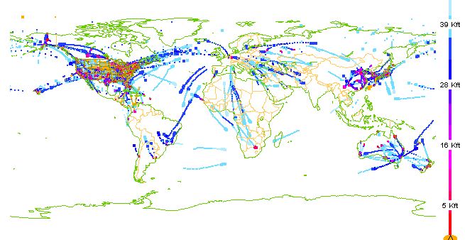
To forecast the atmosphere we need data aloft, since the atmosphere is completely 3D. A relatively new source of information (few decades) is from commercial planes. A number of wide-body aircraft provide important weather data (temperature and winds, mainly). Most of this information is at flight level (typically 30-40 thousand feet), but we also get nice vertical soundings when they land and take off. Here is an example for three-hours on January 7th of this year. Lots of data for flights going to Hawaii and to Asia. But there are holes...big ones.

 | ||
| Getting ready to check the atmosphere of planet Beta-5. |

Satellites can do much more. By sending microwave radiation down to the ocean surface and measuring how much is scattered back, some satellite can tell us the wind speed and direction. Don't believe me? Check this out!

And there is MUCH, MUCH more. The bottom line is that meteorologists now have massive amounts of information from around the globe and this information is used to create a 3D initialization for numerical weather prediction models. We may have some holes and gaps at times, but we are no longer blind over the oceans and polar regions--there are huge amounts of data everywhere.
There is one figure that reveals the impact of all this data on forecasts so beautifully that I have to show you...check the figure below. This tells you about forecast skill in the northern and southern hemisphere from 1981 to now. It is about the skill at 500 hPA--around 18,000 ft, a good middle level. The higher the number (anomaly correlation) the better--100 would be a perfect forecast. You see the forecasts for various forecast ranges (3, 5, 7, and 10 days, varying color). For each color the top line in for the northern hemisphere and the bottom line for the southern hemisphere.

But there is something even more profound. Back in the 80s, the northern hemisphere, with more land area and far more observations, had much higher skill. But that seemed to change in the 90s and the early part of this century. Why? The answer is the satellites. During that period major advances in using satellite data in weather prediction were made. Since there is about as much satellite data in the southern hemisphere as the northern, why should the northern hemisphere have better forecasts?
I was really stunned when I saw this figure for the first time. Few graphs illustrate so concisely how far we have come.
With more satellite data sets coming on line during the next decade, and improvements in the technology of data assimilation, expect further improvements in weather forecasts.


